

Copper is one of those materials that’s been around for ages – thousands of years even. The Neolithic period was followed by the so-called Copper Age, an era in which people discovered the usefulness of the metal as a material and economically valuable commodity, and began exploring processing it professionally. The dates of this period vary somewhat, because its onset was dependent on things including the availability of the material and the technological progress in the respective culture. While there is evidence of copper being used early on in the Near and Middle East – the oldest copper artefacts date back to around 8,000 BC – usage of the metal in Central Europe came relatively late, with the Copper Age ‘only’ commencing in 4,300 BC and lasting until around 2,200 BC. The best known European figure of the Copper Age is Ötzi, otherwise known as the Iceman, who died around 3,300 BC and was found next to a copper axe that was almost completely intact.
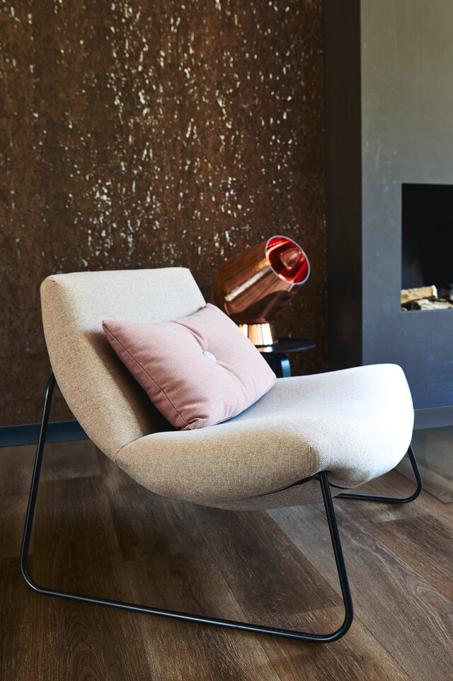
Copper has always been valued for its good processing properties and has been used in a variety of ways since day dot.
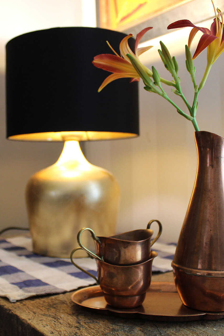

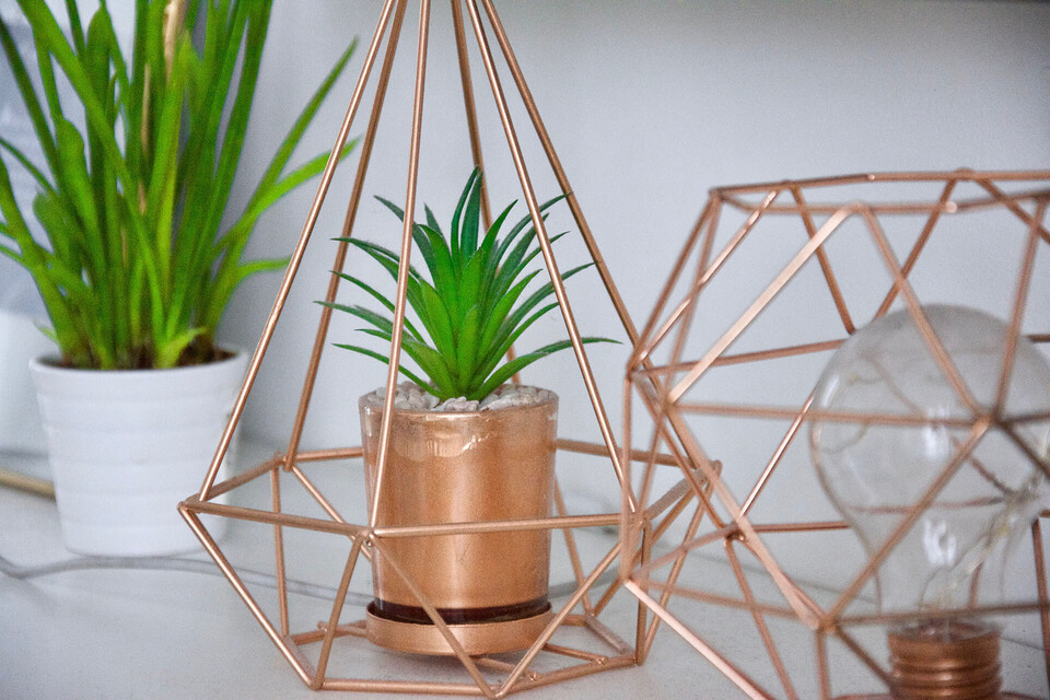
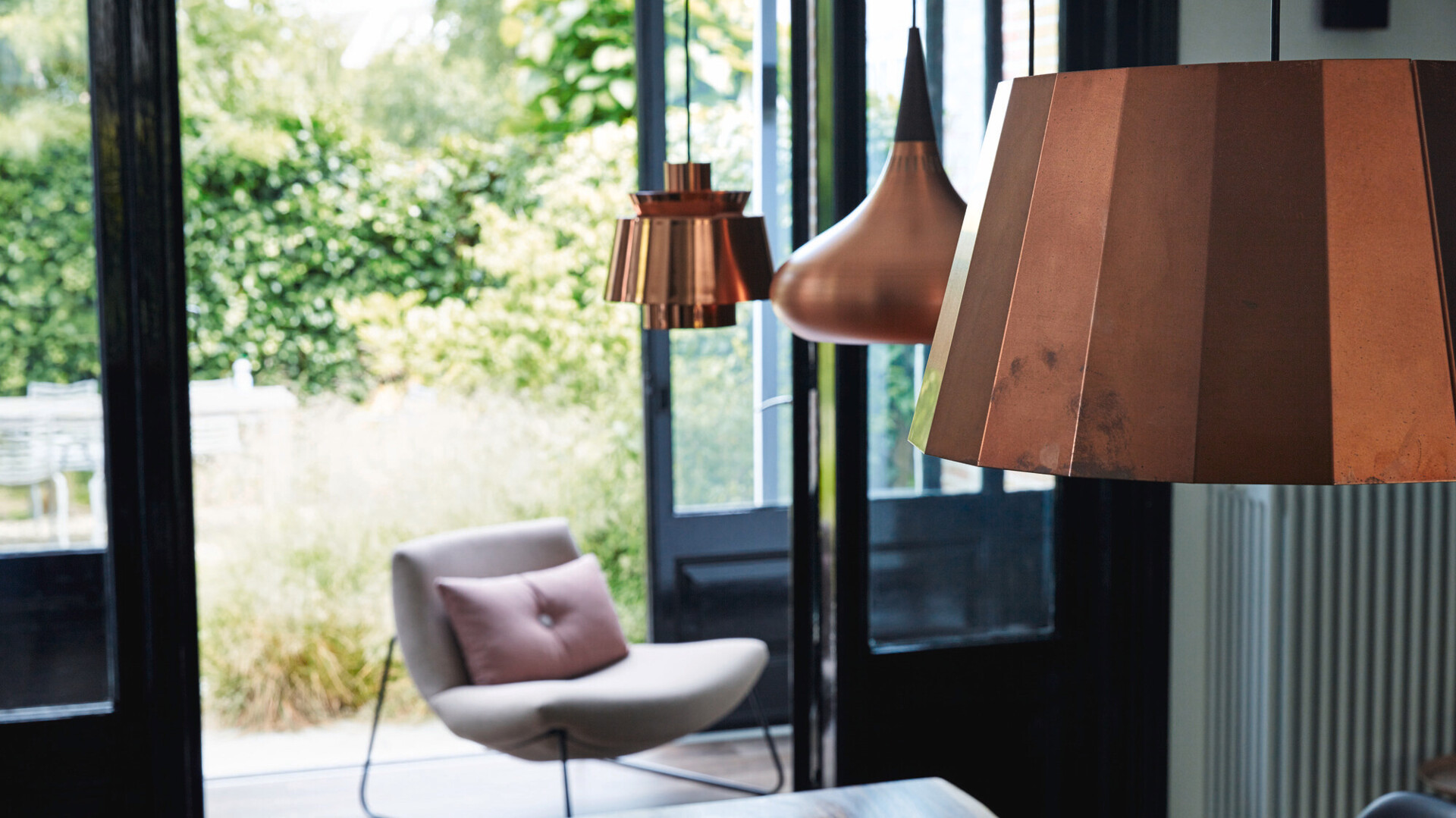
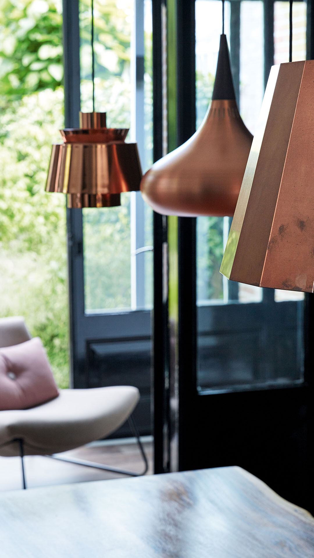
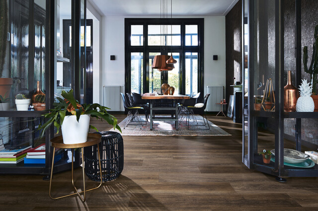
The industrial interior style, which has been enjoying newfound popularity since the turn of the millennium, has made copper a must-have in living spaces – from copper lamps to cookware and glasses, there is hardly an object that the metal can’t be shaped into. To add the finishing touches to industrial style, the material often has a raw, untreated look with matt surfaces, colour deviations and the general impression of good old craftsmanship.
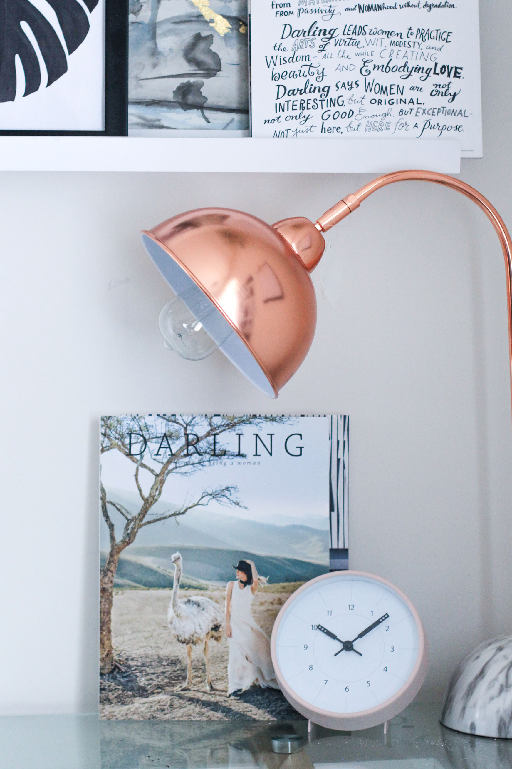
Fans of Scandinavian living know that elements in copper shades are also an important part of Nordic Style. Those on the hunt for matching vases, furniture or lights often end up at the glossy shade – one reason for this metal’s popularity may be found in the common colour combos found in Scandinavian design. Light, inviting colours form the visual basis of Hygge and the like, and really bring rose-coloured elements into their own. Unlike pieces found in industrial-leaning interiors, copper objects in this instance boast geometric forms and delicate contours.
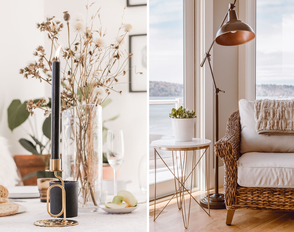
Despite their striking appearance, copper and rose gold tones go well with a variety of other tones. One thing to bear in mind though, is that less is often more. The striking metal really comes into its own alongside well-chosen accents. Even lovers of this look run the risk of falling out of love with coppery tones by overloading their homes with copper-coloured elements.
Those making their first foray into the world of furnishing with copper may be concerned about visually overloading the room and creating in turn a “tacky” overall appearance. Here are the key tips and rules when it comes to using copper and rose gold:
