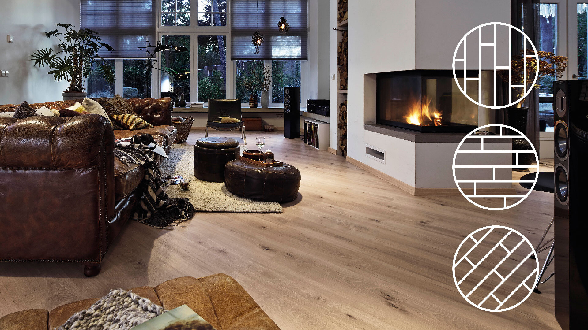
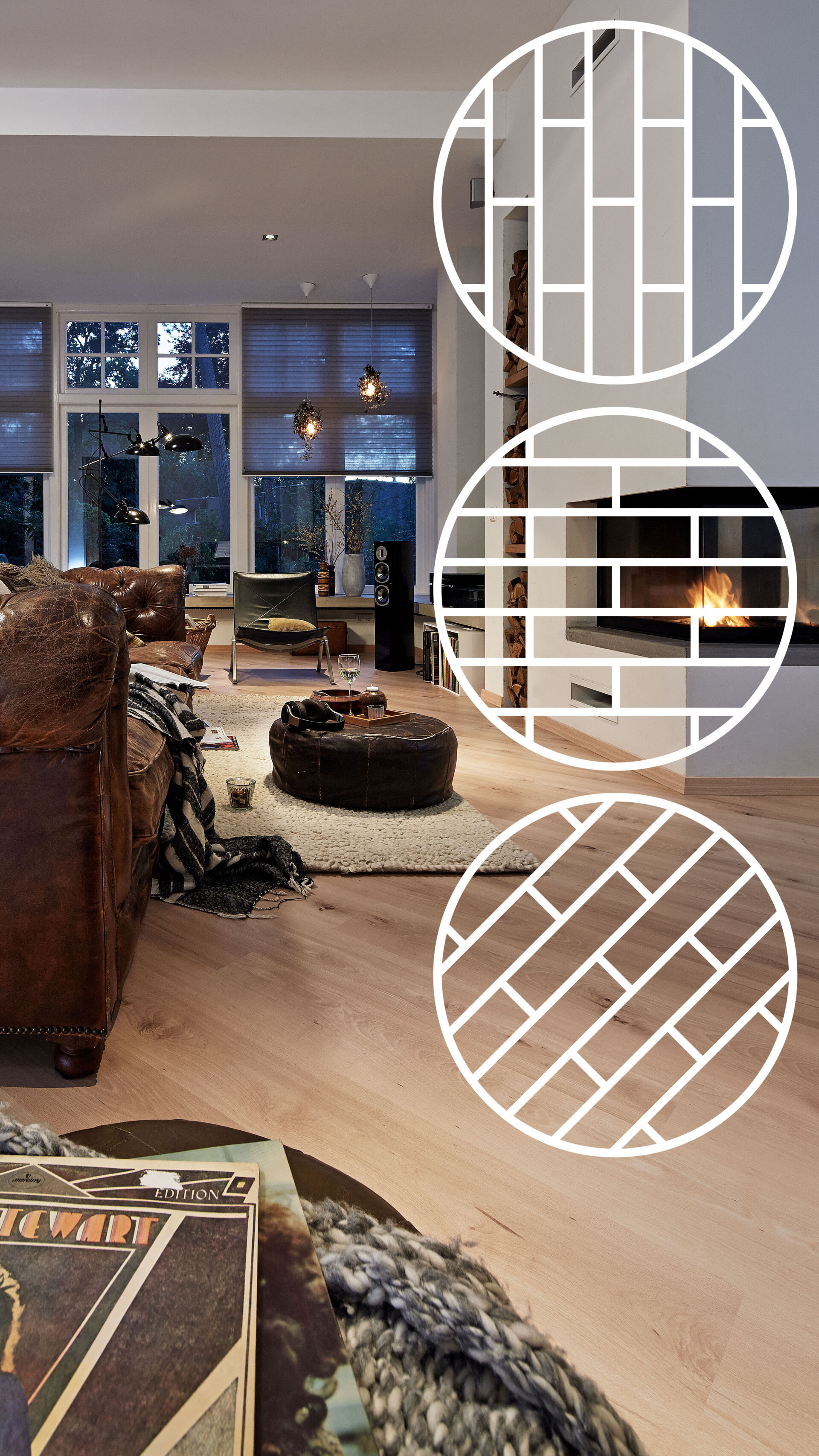

Nothing has an impact on the character of a room like the flooring you lay. But it’s not just the chosen wood, surface finish and colouring that play a role here, it’s also the direction in which the parquet or laminate flooring is laid that has a huge effect on the atmosphere of the room. Anyone looking to create a new look in their living room, kitchen or wherever it may be can make a strong start by considering how the flooring is laid. Small rooms can appear larger and particularly large spaces can be afforded greater structure. The choice of parquet or laminate flooring and how it is laid can even create a uniform, calming impact or achieve a more vivid effect. We can use a room to show you how visually different the laying directions can be.
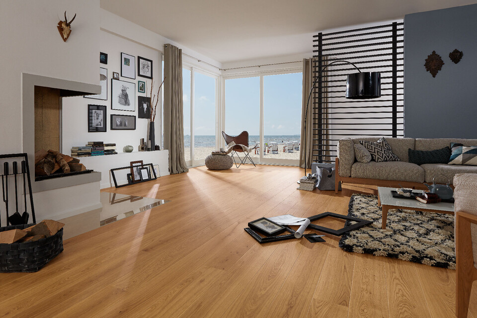
When deciding on a laying direction, there is a general rule of thumb that says that planks should always be laid according to how the natural light enters the room as the main light source. Those who like to lay flooring themselves can’t go wrong with this approach, as laying the planks in the direction of the incoming light helps to conceal joints and any other potential irregularities for a harmonious, even surface finish. At the same time, this technique creates the impression that the planks are actually drawing the light into the space, creating a bright and friendly atmosphere.
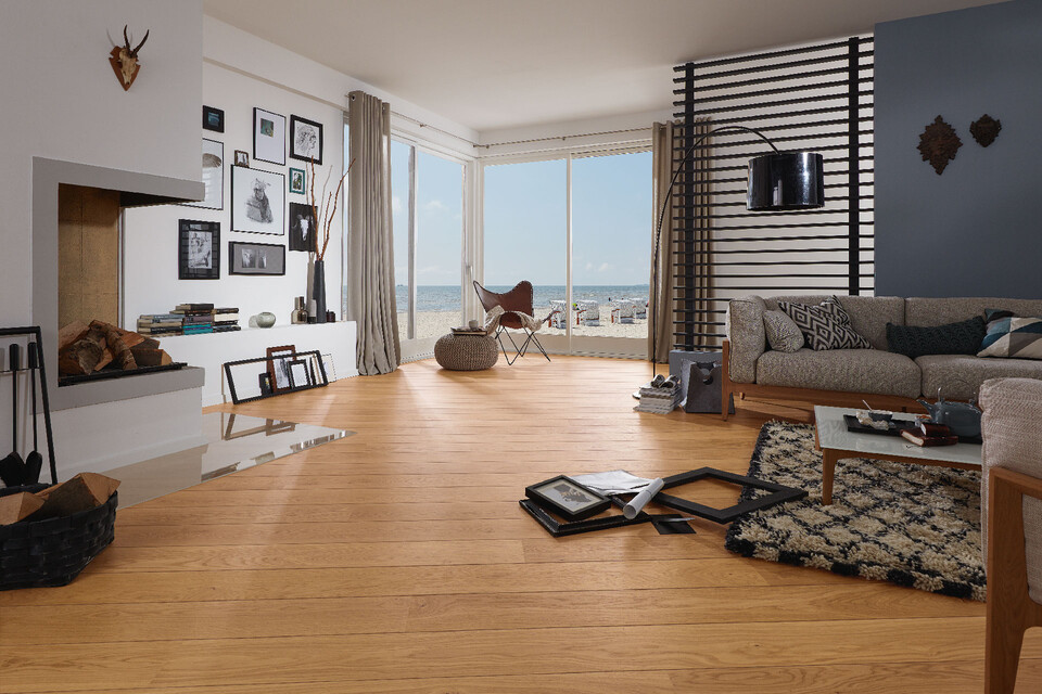
Laying flooring crossways to the natural light source can make a strong statement and is particularly impactful in large spaces, The parallel joints between the planks cast deeper shadows and therefore stand out more. With this in mind, a crossways laying direction is ideal for anyone looking to maximise the impact of their parquet or laminate flooring and highlight its natural character.
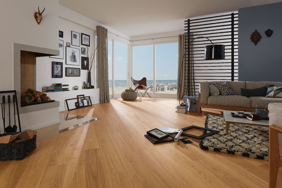
It goes without saying that light doesn’t always enter a room from the same direction, so if a room has several windows then laying the flooring diagonally can be a good solution. This creates a particularly striking effect on the floor that stands in stark contrast to the contours of the rest of the room. But it’s not just the incoming light that can affect the decision on which direction to choose when laying flooring. What do people see when they enter the room? Where does the floor lead them? A narrow hallway, for example, can be made to appear significantly longer by laying the planks and boards lengthways. Laying the flooring crossways, on the other hand, makes the space appear shorter but wider.
The three variants of the laying direction:
Incidentally, it’s not only the laying direction but also the choice of colour that can really revolutionise a space: light-coloured flooring, for example, is ideal for small rooms with low ceilings to create the open, spacious effect of a living space flooded with light. This combined with a light, bright ceiling finish makes the room feel bigger still. At the other end of the spectrum, say, an old building with high ceilings is more than capable of handling dark parquet flooring. The size of the individual planks can also have an impact on the room, which is why many manufacturers of parquet and laminate flooring offer their various ranges in a whole host of different sizes. The larger the planks, the smaller the space appears. With this in mind, smaller rooms can be made to look bigger with flooring made up of smaller strips.
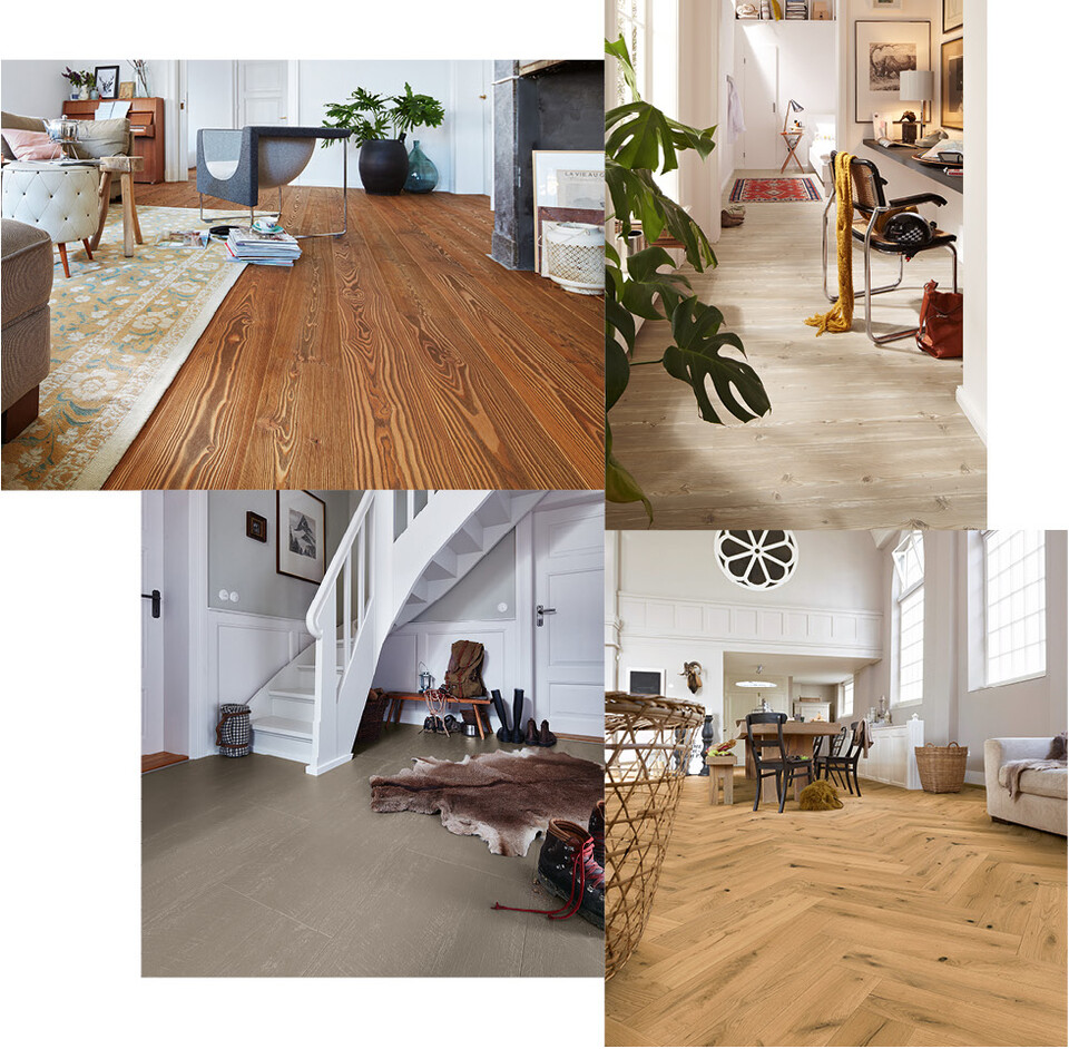
In general, a distinction is made between four plank formats: long plank, short plank, tile formats and strips.
Long planks over two metres long naturally have a particularly beautiful effect in spacious rooms. If they are then equipped with small joints on the long sides (“2 V”), the illusion of the endless plank is complete.
The short plank is the most variable format that adapts perfectly to the room situation. It is particularly easy to lay (and to transport). A compact large tile format looks particularly modern and allows for an exciting laying pattern even in smaller rooms. With rod formats, completely different laying patterns can be realised: From the alternate joint layout (evenly staggered) to a “wild” layout (randomly staggered) to the trendy herringbone layout, the possible selection is as large as you would expect.